
Corporate Private Cloud Homepage

SCOPE
Webpage
ROLE
Lead UX Designer
DURATION
11/22 – 01/23


Overview
The current homepage for a company's private cloud network needs rework. The homepage's appearance must be modified to be streamlined, user-friendly and functional, while also adhering to the company brand standards and accessibility regulations.
Objective
As the lead UX designer for this project, investigate and address current usability issues in the homepage through a complete redesign. Alongside the rest of the UX team, conduct UX research to uncover these usability issues and base the redesign off of these findings.
Outcome
The homepage now has an accessible and streamlined redesign with functional and customizable features for both frequent and infrequent users of the cloud network. The branding complies with company standards.
This project was completed while I was employed at a previous company. Due to NDA, I have redacted colors, fonts, logos, graphics, and data and replaced the content.
Getting Started
For this project, the UX team and I utilized an iterative user-centered design approach which allowed us to efficiently conduct research, analyze results, and create a cohesive design solution. To begin, we formulated key questions that we later answered through research:
Who are the primary users?
What should this homepage offer to users?
When and where can this homepage be used?
Why would users want to use this homepage?
The animation shows how the homepage looked like prior to any changes and redesign.


EMPATHIZE
Research goals
User interviews

DEFINE
Pain points
Empathy map

IDEATE
Best in class
Big idea vignette
Prioritization grid

PROTOTYPE
High-fidelity wireframes

TEST
A/B testing
High-fidelity prototype
Developer handoff
Phase 1: Empathize
Evaluating the Current Homepage
During the Empathize phase of the user-centered design process, we worked to understand the present landscape. After going through these steps, I was able to draw conclusions which informed the next stage of the design process – Define.
Methodology
Define research goals
Conduct user interviews
Research Goals

How do users feel about the current homepage? Should it be improved?

What pain points do users experience when navigating the current homepage?

Are there any features users wish that the homepage revamp would include?

Would improvements to the homepage drive better traffic and overall usage?
User Interviews
I conducted one-on-one user interviews with a group of 5 diverse individuals, selecting from a pool of users who had expressed interest in improving the current homepage. Using the research goals we had previously come up with as a starting point, I asked open-ended questions which I believed would shed light on existing pain points in the existing homepage, as well as what users would like to see in the revamp.
Key pain points from interviews:
Important information and links are below the fold.
The header portion takes up too much real estate.
Feels cluttered.
Want a way to access frequented pages quickly.
An at-a-glance task view would be helpful.

Phase 2: Define
Organizing Prior Research & Pain Points
After completing the Empathize phase, we moved on to the second phase – Define. During this phase, we consolidated research findings to draw actionable conclusions. The third phase – Ideate – is dedicated to finding the most viable solution to what I've defined in this phase.
Methodology
Identify pain points
Create an empathy map.
Pain Points

Overall clutter and disorganization on the page, making it difficult to navigate.

Cannot see much use in a homepage as it doesn't have useful functions.

Lot of real estate taken up by header banner, which doesn't serve much purpose.

Too many links to see announcements /release notes; want to see it at once.
Empathy Map
The empathy map allowed us to see a general user's thoughts and feelings regarding the homepage, as well as an overview of what interview participants said and did while they were navigating the homepage.

Phase 3: Ideate
Brainstorming Design Solutions
For the Ideate phase of the user-centered design process, we took the conclusions we drew from the Understand phase and transferred them into design ideas. Once we were through with that, it was onto the fourth phase – Prototype.
Methodology
Research best in class
Assemble a big idea vignette
Prioritize via prioritization grid
Best in Class
During this process, we researched and found examples of designs we thought would cater to the identified pain points. After presenting our selections, we voted for design elements to try implementing.

Big Idea Vignette
Once we finished analyzing the best in class examples, we created rough mockups for a revamped homepage – essentially a vignette of big ideas. Again, we voted for ideas we liked best.

Prioritization Grid
Lastly, we prioritized what should be designed and developed using a prioritization grid. Low-hanging fruit would be tackled first, and more challenging and less impactful additions would be placed in the backlog.


Phase 4: Prototype
From Concept to Figma
Methodology
Design high-fidelity wireframes
In the fourth stage of the design process, I took our ideas from the previous phase and expanded upon them. Since we have Figma component libraries readily available, the process was straightforward. Once this was completed, it was onto the final phase of the process – Test.
High-Fidelity Wireframes


Phase 5: Test
The Final Steps
To kick-off the last phase of this design process, I started with usability testing, and iterated upon that feedback, ensuring that I addressed the pain points we defined during the Define phase. Culminating this experience, I got to work with the development team to make this homepage come alive.
Methodology
Conduct A/B testing
Create high-fidelity prototype
Prepare guidelines for developer handoff
A/B Testing

Minimal – No icons or descriptions

Full-width header and footer

Light menu bar
In order to gage user opinion, I conducted A/B tests using various versions of the high-fidelity homepage prototype. I did this by scheduling individual sessions with 6 diverse users, and then used their responses to inform my final prototypes which I would hand off to the developers.
Key feedback from testing:
Preference for dark sidebar over light.
Full-page sidebar seems more user-friendly than full-width header and footer.
Users like having both icons and section titles.
High-Fidelity Prototype


Addressed Pain Point:
Overall clutter and disorganization on the page, making it difficult to navigate.
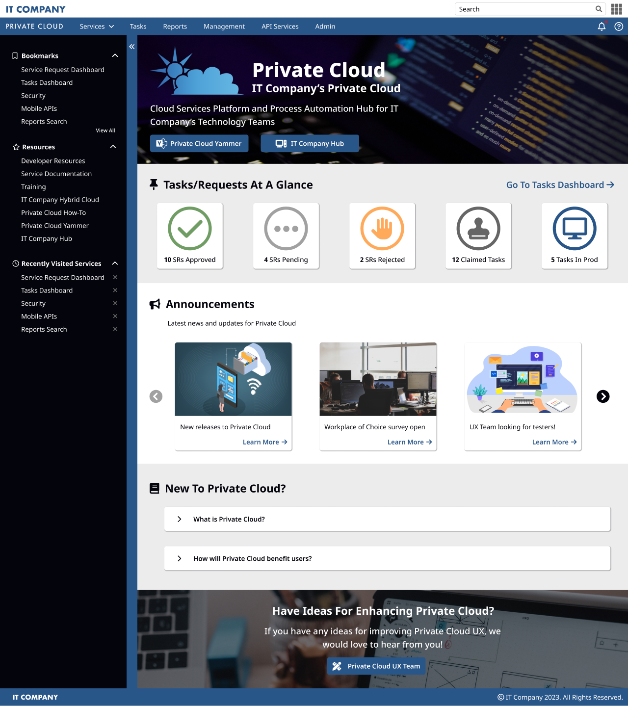
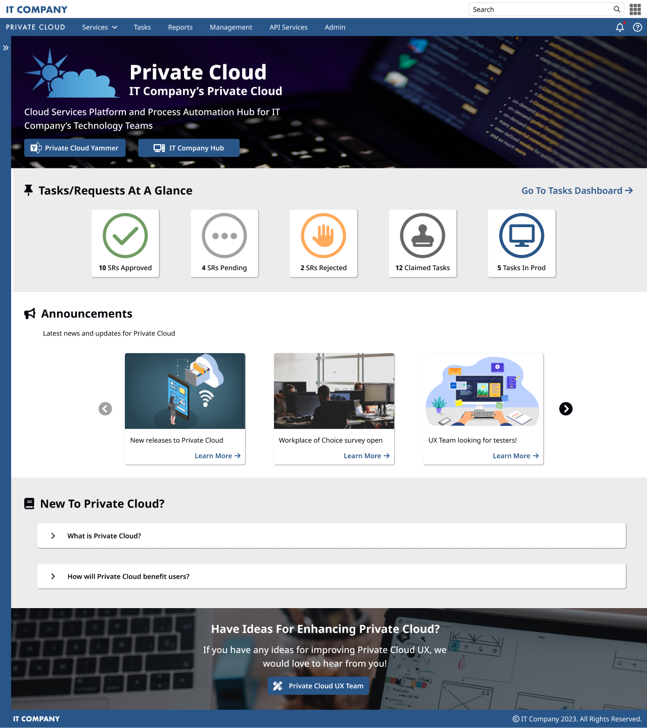
There are accordion panels for expanding and closing the “New to Private Cloud?” informational sections. Users can collapse the sidebar to the left side, as well as expand or collapse each menu category within the sidebar. This creates a clean and streamlined look.


Addressed Pain Point:
Cannot see much use in a homepage as it doesn't have useful functions.
The “Tasks/Requests At a Glance” section, the “Announcements” carousel, and the “New to Private Cloud?” accordion panels greatly increase functionality of the home page. Users were especially excited to see the first section as it allowed them to quickly view which recent tasks or requests they had to handle.


Addressed Pain Point:
Lot of real estate taken up by header banner, which doesn't serve much purpose.
With the height of the header banner reduced, real estate on the homepage increases, allowing for vital links and important information to be visible above the fold. The addition of the Yammer and IT Hub buttons further increases ease of use. Removing the large button panels and adding them to the sidebar also aids in this.


Addressed Pain Point:
Too many links to see announcements /release notes; want to see it at once.
This issue would be solved with the introduction of a global notification bell system, which houses recent announcements and release notes from code deployments. In this way, users can access this information from any area of the Private Cloud site, and would also be notified of any changes as they happen.
Developer Handoff

The last aspect of this was to handoff all the mockups and prototypes to the developers. Since this feature would be going in during the first quarter of 2023, I split the project into stages, with each stage corresponding to a bi-weekly code release.
I made sure that every stage would have significant changes, but at the same time wouldn’t overwhelm the developers. I also worked with them as they developed to make sure that styles were correctly applied and branding was properly adhered to.

Retrospective
Working as the lead UX Designer for this project was an extremely exciting and rewarding experience for me. I had the opportunity to tackle many different areas of the design process, in every part of the user-centered design methodology.
In addition, I got to work with the developers; this allowed me to visualize both design and coding perspectives. If I were to do this again, I would try and run a variety of surveys to get a wider range of user input and feedback, thus aiding in ideation.

